
How to write touchscreen exhibit text visitors actually read
Word counts, title formulas, and before-and-after examples for touchscreen labels in museums, schools, and lobbies. Plus a checklist to run before you publish.
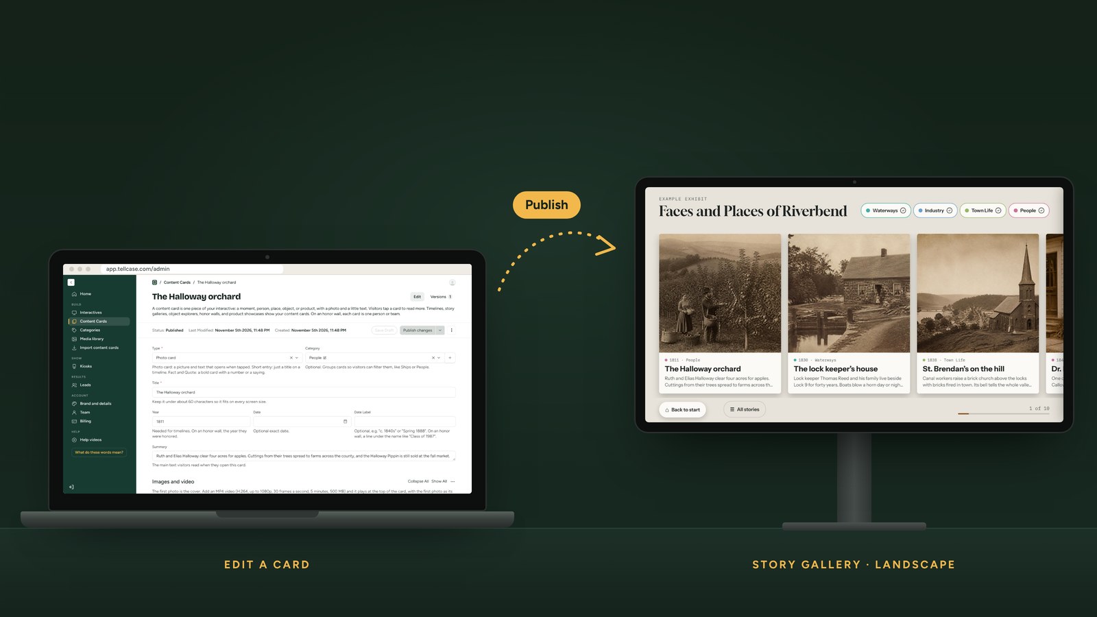
Most touchscreen exhibits don’t fail because of the screen. They fail because of the text. A visitor taps a card, sees a gray block of 300 words, and walks away. The fix isn’t fancier software. It’s shorter, sharper writing.
These rules work for timelines, story galleries, object explorers, honor walls, and product showcases.
The numbers to aim for
| Piece | Target | Why |
|---|---|---|
| Title | A few words, under about 60 characters | Fits on one or two lines on any screen |
| Main text | 40 to 70 words | Reads in about 20 seconds, standing up |
| Hotspot note | One or two sentences | Visitors are looking at the object, not the words |
| Highlights or specs | 4 to 8 short lines | Easy to scan for people who want the facts |
| Quote | One or two sentences, with who said it | Short quotes get read and remembered |
Exhibit label writers have recommended about 50 words per label for decades, and it holds up on screens. Seventy words is a ceiling, not a goal. In Tellcase, the main text of a card holds up to 400 characters, which is about 60 to 70 words.
Write titles that earn the tap
On a touchscreen, visitors decide what to open from the title alone. A title that’s just a date or a name gets skipped.
- Instead of: “1834” Try: “Canal diggers reach the county line”
- Instead of: “The Halloway Family” Try: “The orchard that fed three counties”
- Instead of: “Model 4200” Try: “The drill that runs a full shift on one charge”
A good title says what happened, what’s surprising, or why it matters. Keep the date or name nearby as a label, not as the headline.
Lead with the interesting part
Most first drafts open with background and save the good part for last. Flip it. Put the surprising fact, the human detail, or the result first, then the context.
Before (59 words):
The Riverbend Canal was authorized by the state legislature in 1827 as part of a larger network of internal improvements intended to connect farming communities to markets. Construction began in 1829 and was carried out mostly by hand, using shovels and wheelbarrows. Workers were paid about 50 cents a day. The section through the county was completed in 1834.
After (44 words):
They dug it by hand. For five years, crews with shovels and wheelbarrows cut the canal through the county, earning about 50 cents a day. When the last stretch opened in 1834, a farmer’s wheat could reach the city in days instead of weeks.
Same facts, fewer words, and the second version gives visitors a reason to care.
One idea per card
If a card covers two things, split it into two cards. Visitors tap around in any order, so each card has to make sense on its own. Avoid phrases like “as mentioned earlier” or “later that year.” Name the year or the person again instead.
Write for a curious 12-year-old
Not a child, not a specialist. Someone smart who doesn’t know your subject yet.
- Short sentences. If you need a comma and an “and,” try two sentences.
- Everyday words. “Bought” instead of “acquired.” “Built” instead of “constructed.”
- Explain or cut jargon. If a term matters, define it in the same sentence.
- Active voice. “Volunteers rebuilt the barn” beats “The barn was rebuilt by volunteers.”
Plain writing also helps visitors reading in a second language and people using larger text. Our accessible touchscreen exhibits checklist has more.
Use the right kind of card
Not every item needs a photo and a paragraph. Mixing card types keeps an exhibit from feeling like a slideshow.
- Photo card: a picture with a title and short text. The workhorse.
- Short entry: just a title, for small moments on a timeline.
- Fact: one big number with a line of context, like “1 million drills shipped.”
- Quote: a person’s own words, with who said it and when.
In a timeline of 30 moments, try something like 20 photo cards, a few short entries, a couple of facts, and a couple of quotes.
Put the details somewhere else
Long text usually means someone didn’t want to cut good material. Don’t cut it. Move it.
- Stats and dates go in a highlights or specs list, like “1994: State champion, 1600 meters.”
- Close-up details on an object go in hotspots, each with a short label and note.
- The long version goes in a short video, with captions.
- Sources and full history can live on your website.
Write good alt text
Every image needs a short description for visitors using screen readers. Describe what’s in the picture and why it’s there, in one sentence. “Two women sorting apples in an orchard, about 1910” is better than “photo” or the file name.
Check it before you publish
Run through this list for every card:
- Title under about 60 characters and says something, not just a date
- Main text 40 to 70 words, one idea
- Interesting part in the first sentence
- Makes sense without reading any other card
- No unexplained jargon
- Every image has alt text
- Every video has captions
- Read out loud once. If you run out of breath, it’s too long.
Then watch three real visitors use it. Where they stop reading is where to cut.
Write it in Tellcase
Tellcase builds the card types above into every template, and the editor reminds you to keep titles short. Before you publish, the accessibility check flags missing or placeholder alt text, uncaptioned videos, and text colors that are hard to read. One person can write, edit, and publish from a browser, and changes reach the kiosk within a few minutes.
Writing an honor wall? See how to write honoree profiles. Building a timeline? See how to build a touchscreen timeline exhibit. Or start a 14-day free trial and try your first card today.
Quick answers
How many words should a touchscreen exhibit label have?
About 40 to 70 words for the main text of each card, and a title of a few words. That matches what exhibit label writers have long recommended for wall labels, and it fits a screen without scrolling. Put extra detail in a highlights list, a quote card, or a video.
How long should a title be on a touchscreen?
Under about 60 characters, so it fits on one or two lines on any screen. A good title says what happened or why it matters, not just a date or a name.
What reading level should exhibit text be?
Write so a curious 12-year-old can follow it. Short sentences, everyday words, and one idea per card. Adults read plain text faster too, and it works better for visitors reading in a second language.
Should touchscreen text be different from wall label text?
Mostly it follows the same rules, with two differences. Visitors choose what to open, so titles have to earn the tap. And screens show less text at once, so each card should stand on its own without the one before it.